Phrasensuche, die genaue Zeichenfolge ist in allen Ergebnissen enthalten: 100 Treffer
AAP Archive Artist Publications - Munich - www.artistbooks.de
|
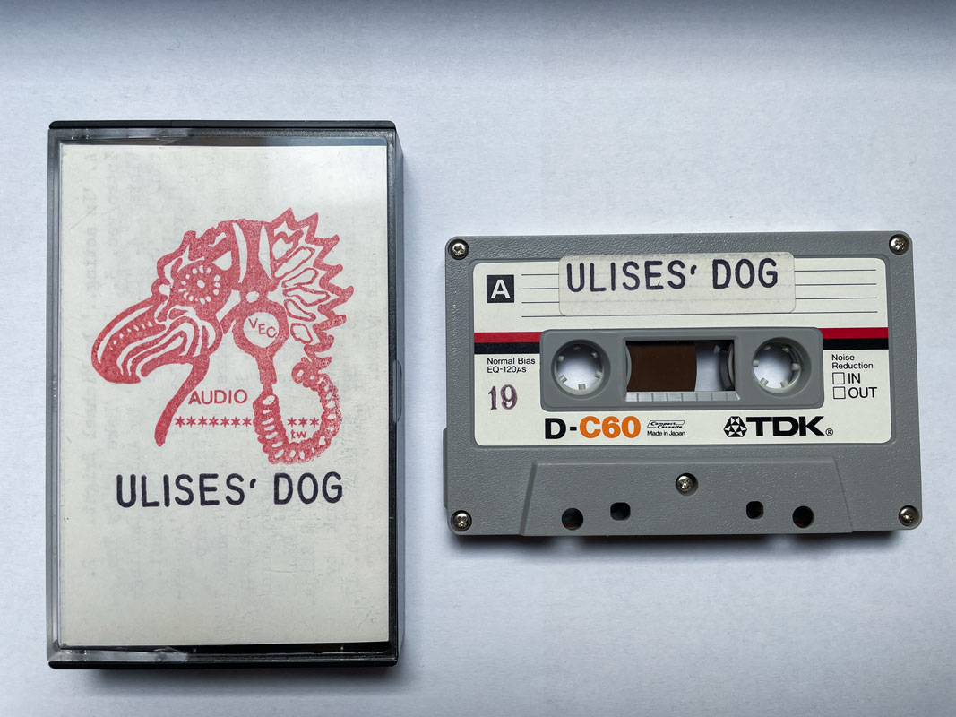
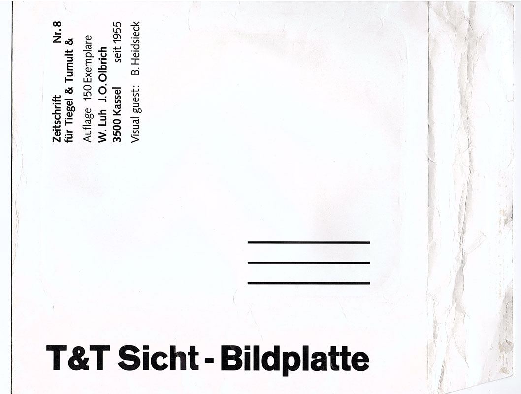
Verfasser
Titel
Verlag Jahr
Ort Land
Medium
Technische
Angaben
Schlagwort
TitelNummer
|
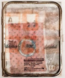
Verfasser
Titel
Verlag Jahr
Ort Land
Medium
Technische
Angaben
Sprache
Weitere Personen
Schlagwort
TitelNummer
|
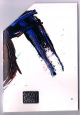
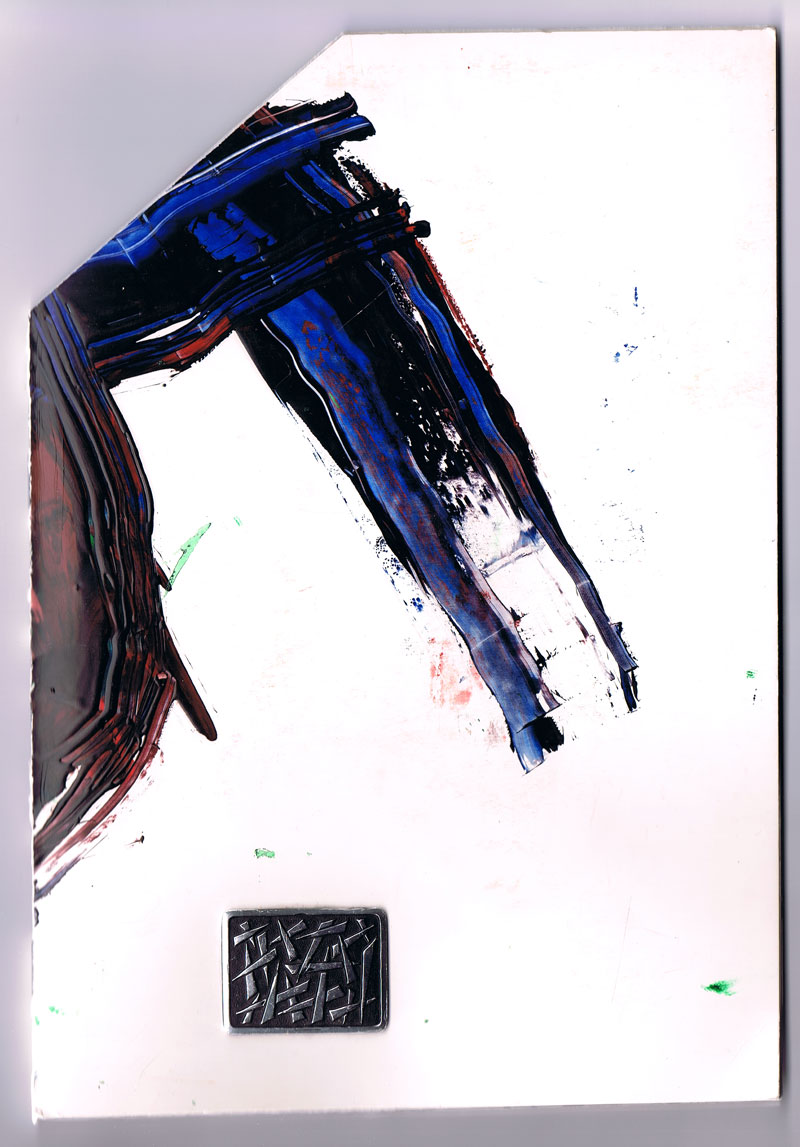
Verfasser
Titel
Ort Land
Medium
Technische
Angaben
Schlagwort
TitelNummer
|
Verfasser
Titel
Verlag Jahr
Ort Land
Medium
Technische
Angaben
ZusatzInfos
Weitere Personen
Schlagwort
WEB Link
TitelNummer
|
Verfasser
Titel
Verlag Jahr
Ort Land
Medium
Technische
Angaben
Schlagwort
TitelNummer
|
Verfasser
Titel
Verlag Jahr
Ort Land
Medium
Technische
Angaben
Schlagwort
TitelNummer
|
Verfasser
Titel
Verlag Jahr
Ort Land
Medium
Technische
Angaben
Schlagwort
TitelNummer
|
Verfasser
Titel
Verlag Jahr
Ort Land
Medium
Technische
Angaben
Schlagwort
TitelNummer
|
Verfasser
Titel
Verlag Jahr
Ort Land
Medium
Technische
Angaben
Sprache
ZusatzInfos
Schlagwort
TitelNummer
|
Verfasser
Titel
Verlag Jahr
Medium
Technische
Angaben
Sprache
ZusatzInfos
Weitere Personen
Schlagwort
WEB Link
TitelNummer
|
Verfasser
Titel
Verlag Jahr
Ort Land
Medium
Technische
Angaben
Schlagwort
TitelNummer
|
Verfasser
Titel
Verlag Jahr
Ort Land
Medium
Technische
Angaben
Schlagwort
TitelNummer
|
Verfasser
Titel
Verlag Jahr
Ort Land
Medium
Technische
Angaben
Schlagwort
TitelNummer
|
Verfasser
Titel
Verlag Jahr
Ort Land
Medium
Technische
Angaben
Schlagwort
TitelNummer
|
Verfasser
Titel
Verlag Jahr
Ort Land
Medium
Technische
Angaben
Schlagwort
TitelNummer
|
Verfasser
Titel
Verlag Jahr
Ort Land
Medium
Technische
Angaben
Schlagwort
TitelNummer
|
Verfasser
Titel
Verlag Jahr
Ort Land
Medium
Technische
Angaben
Schlagwort
TitelNummer
|
Verfasser
Titel
Verlag Jahr
Ort Land
Medium
Technische
Angaben
Weitere Personen
Schlagwort
TitelNummer
|
Verfasser
Titel
Verlag Jahr
Ort Land
Medium
Technische
Angaben
Schlagwort
TitelNummer
|
Verfasser
Titel
Verlag Jahr
Ort Land
Medium
Technische
Angaben
Schlagwort
TitelNummer
|
Verfasser
Titel
Verlag Jahr
Ort Land
Medium
Technische
Angaben
Schlagwort
TitelNummer
|
Verfasser
Titel
Verlag Jahr
Ort Land
Medium
Technische
Angaben
Schlagwort
TitelNummer
|
Verfasser
Titel
Verlag Jahr
Ort Land
Medium
Technische
Angaben
Schlagwort
TitelNummer
|
Verfasser
Titel
Verlag Jahr
Ort Land
Medium
Technische
Angaben
Schlagwort
TitelNummer
|
Verfasser
Titel
Verlag Jahr
Ort Land
Medium
Technische
Angaben
Schlagwort
TitelNummer
|
Verfasser
Titel
Verlag Jahr
Ort Land
Medium
Technische
Angaben
Schlagwort
TitelNummer
|
Verfasser
Titel
Verlag Jahr
Ort Land
Medium
Technische
Angaben
Schlagwort
TitelNummer
|
Verfasser
Titel
Verlag Jahr
Ort Land
Medium
Technische
Angaben
Schlagwort
TitelNummer
|
Verfasser
Titel
Verlag Jahr
Ort Land
Medium
Technische
Angaben
Schlagwort
TitelNummer
|
Verfasser
Titel
Verlag Jahr
Ort Land
Medium
Technische
Angaben
Schlagwort
TitelNummer
|
Verfasser
Titel
Verlag Jahr
Ort Land
Medium
Technische
Angaben
Schlagwort
TitelNummer
|
Verfasser
Titel
Verlag Jahr
Ort Land
Medium
Technische
Angaben
Schlagwort
TitelNummer
|
Verfasser
Titel
Verlag Jahr
Ort Land
Medium
Technische
Angaben
Schlagwort
TitelNummer
|
Verfasser
Titel
Verlag Jahr
Ort Land
Medium
Technische
Angaben
Schlagwort
TitelNummer
|
Verfasser
Titel
Verlag Jahr
Ort Land
Medium
Technische
Angaben
Schlagwort
TitelNummer
|
Verfasser
Titel
Verlag Jahr
Ort Land
Medium
Technische
Angaben
Sprache
ZusatzInfos
Weitere Personen
Schlagwort
TitelNummer
|
Verfasser
Titel
Verlag Jahr
Ort Land
Medium
Technische
Angaben
Sprache
ZusatzInfos
Schlagwort
TitelNummer
|
Verfasser
Titel
Verlag Jahr
Ort Land
Medium
Technische
Angaben
Sprache
ZusatzInfos
Weitere Personen
Schlagwort
TitelNummer
|
Verfasser
Titel
Verlag Jahr
Ort Land
Medium
Technische
Angaben
Sprache
ZusatzInfos
Weitere Personen
Schlagwort
TitelNummer
|
Verfasser
Titel
Verlag Jahr
Ort Land
Medium
Technische
Angaben
Sprache
ZusatzInfos
Weitere Personen
Schlagwort
TitelNummer
|
Verfasser
Titel
Verlag Jahr
Ort Land
Medium
Technische
Angaben
Sprache
ZusatzInfos
Schlagwort
TitelNummer
|
Verfasser
Titel
Verlag Jahr
Ort Land
Medium
Technische
Angaben
Sprache
ZusatzInfos
Schlagwort
TitelNummer
|
Verfasser
Titel
Verlag Jahr
Ort Land
Medium
Technische
Angaben
Sprache
ZusatzInfos
Schlagwort
TitelNummer
|
Verfasser
Titel
Verlag Jahr
Ort Land
Medium
Technische
Angaben
Sprache
ZusatzInfos
Weitere Personen
Schlagwort
TitelNummer
|
Verfasser
Titel
Verlag Jahr
Ort Land
Medium
Technische
Angaben
Sprache
ZusatzInfos
Weitere Personen
Schlagwort
TitelNummer
|
 
Verfasser
Titel
Verlag Jahr
Ort Land
Medium
Technische
Angaben
Sprache
ZusatzInfos
Weitere Personen
Schlagwort
TitelNummer
|
Verfasser
Titel
Verlag Jahr
Ort Land
Medium
Technische
Angaben
Schlagwort
TitelNummer
|
Verfasser
Titel
Verlag Jahr
Ort Land
Medium
Technische
Angaben
Schlagwort
TitelNummer
|
 
Verfasser
Titel
Verlag Jahr
Ort Land
Medium
Technische
Angaben
Schlagwort
TitelNummer
|
Verfasser
Titel
Verlag Jahr
Ort Land
Medium
Technische
Angaben
Schlagwort
TitelNummer
|
Verfasser
Titel
Verlag Jahr
Ort Land
Medium
Technische
Angaben
Schlagwort
TitelNummer
|
Verfasser
Titel
Verlag Jahr
Ort Land
Medium
Technische
Angaben
Schlagwort
TitelNummer
|
Verfasser
Titel
Verlag Jahr
Ort Land
Medium
Technische
Angaben
Schlagwort
TitelNummer
|
Verfasser
Titel
Verlag Jahr
Ort Land
Medium
Technische
Angaben
Schlagwort
TitelNummer
|
Verfasser
Titel
Verlag Jahr
Ort Land
Medium
Technische
Angaben
Schlagwort
TitelNummer
|
Verfasser
Titel
Verlag Jahr
Ort Land
Medium
Technische
Angaben
Schlagwort
TitelNummer
|
Verfasser
Titel
Verlag Jahr
Ort Land
Medium
Technische
Angaben
Schlagwort
TitelNummer
|
Verfasser
Titel
Verlag Jahr
Ort Land
Medium
Technische
Angaben
Schlagwort
TitelNummer
|
Verfasser
Titel
Verlag Jahr
Ort Land
Medium
Technische
Angaben
Schlagwort
TitelNummer
|
Verfasser
Titel
Verlag Jahr
Ort Land
Medium
Technische
Angaben
Schlagwort
TitelNummer
|
Verfasser
Titel
Verlag Jahr
Ort Land
Medium
Technische
Angaben
Schlagwort
TitelNummer
|
Verfasser
Titel
Verlag Jahr
Ort Land
Medium
Technische
Angaben
Sprache
ZusatzInfos
Weitere Personen
Schlagwort
WEB Link
GND Permalink
TitelNummer
|
Verfasser
Titel
Verlag Jahr
Ort Land
Medium
Technische
Angaben
ZusatzInfos
Weitere Personen
Schlagwort
WEB Link
TitelNummer
|
Verfasser
Titel
Verlag Jahr
Ort Land
Medium
Technische
Angaben
ZusatzInfos
Weitere Personen
Schlagwort
WEB Link
TitelNummer
|
 
Verfasser
Titel
Verlag Jahr
Ort Land
Medium
Technische
Angaben
ZusatzInfos
Weitere Personen
Schlagwort
WEB Link
TitelNummer
|
Verfasser
Titel
Verlag Jahr
Ort Land
Medium
Technische
Angaben
ZusatzInfos
Weitere Personen
Schlagwort
WEB Link
Geschenk von
TitelNummer
|
Verfasser
Titel
Verlag Jahr
Ort Land
Medium
Technische
Angaben
ZusatzInfos
Weitere Personen
Schlagwort
WEB Link
TitelNummer
|
Verfasser
Titel
Verlag Jahr
Ort Land
Medium
Technische
Angaben
Sprache
ZusatzInfos
Weitere Personen
Schlagwort
WEB Link
TitelNummer
|
Verfasser
Titel
Verlag Jahr
Ort Land
Medium
Technische
Angaben
ZusatzInfos
Weitere Personen
Schlagwort
WEB Link
TitelNummer
|
Verfasser
Titel
Verlag Jahr
Ort Land
Medium
Technische
Angaben
ZusatzInfos
Weitere Personen
Schlagwort
WEB Link
TitelNummer
|
Verfasser
Titel
Verlag Jahr
Ort Land
Medium
Technische
Angaben
Schlagwort
WEB Link
TitelNummer
|
Verfasser
Titel
Verlag Jahr
Ort Land
Medium
Technische
Angaben
ZusatzInfos
Weitere Personen
Schlagwort
WEB Link
TitelNummer
|
Verfasser
Titel
Verlag Jahr
Ort Land
Medium
Technische
Angaben
Sprache
ZusatzInfos
Weitere Personen
Schlagwort
WEB Link
TitelNummer
|
Verfasser
Titel
Verlag Jahr
Ort Land
Medium
Technische
Angaben
ZusatzInfos
Weitere Personen
Schlagwort
WEB Link
TitelNummer
|
Verfasser
Titel
Verlag Jahr
Ort Land
Medium
Technische
Angaben
ZusatzInfos
Weitere Personen
Schlagwort
WEB Link
TitelNummer
|
Verfasser
Titel
Verlag Jahr
Ort Land
Medium
Technische
Angaben
Weitere Personen
Schlagwort
WEB Link
TitelNummer
|
Verfasser
Titel
Verlag Jahr
Ort Land
Medium
Technische
Angaben
ZusatzInfos
Weitere Personen
Schlagwort
WEB Link
TitelNummer
|
Verfasser
Titel
Verlag Jahr
Ort Land
Medium
Technische
Angaben
Sprache
ZusatzInfos
Weitere Personen
Schlagwort
WEB Link
TitelNummer
|
Verfasser
Titel
Verlag Jahr
Ort Land
Medium
Technische
Angaben
Sprache
ZusatzInfos
Weitere Personen
Schlagwort
WEB Link
TitelNummer
|
Verfasser
Titel
Verlag Jahr
Ort Land
Medium
Technische
Angaben
Sprache
ZusatzInfos
Weitere Personen
Schlagwort
WEB Link
TitelNummer
|
Verfasser
Titel
Verlag Jahr
Ort Land
Medium
Technische
Angaben
Sprache
ZusatzInfos
Weitere Personen
Schlagwort
WEB Link
TitelNummer
|
Verfasser
Titel
Verlag Jahr
Ort Land
Medium
Technische
Angaben
ZusatzInfos
Weitere Personen
Schlagwort
WEB Link
TitelNummer
|
Verfasser
Titel
Verlag Jahr
Ort Land
Medium
Technische
Angaben
Weitere Personen
Schlagwort
WEB Link
TitelNummer
|
Verfasser
Titel
Verlag Jahr
Ort Land
Medium
Technische
Angaben
ZusatzInfos
Weitere Personen
Schlagwort
WEB Link
TitelNummer
|
Verfasser
Titel
Verlag Jahr
Ort Land
Medium
Technische
Angaben
Schlagwort
TitelNummer
|
Verfasser
Titel
Ort Land
Medium
Technische
Angaben
Schlagwort
TitelNummer
|
 
Verfasser
Titel
Verlag Jahr
Ort Land
Medium
Technische
Angaben
Schlagwort
TitelNummer
|
Verfasser
Titel
Medium
Technische
Angaben
Schlagwort
TitelNummer
|
Verfasser
Titel
Verlag Jahr
Ort Land
Medium
Technische
Angaben
ZusatzInfos
Weitere Personen
Schlagwort
TitelNummer
|
Verfasser
Titel
Verlag Jahr
Ort Land
Medium
Technische
Angaben
Schlagwort
TitelNummer
|
Verfasser
Titel
Verlag Jahr
Ort Land
Medium
Technische
Angaben
Schlagwort
TitelNummer
|
Verfasser
Titel
Verlag Jahr
Ort Land
Medium
Technische
Angaben
Schlagwort
TitelNummer
|
 
Verfasser
Titel
Verlag Jahr
Ort Land
Medium
Technische
Angaben
ZusatzInfos
Schlagwort
TitelNummer
|
Verfasser
Titel
Verlag Jahr
Ort Land
Medium
Technische
Angaben
ZusatzInfos
Weitere Personen
Schlagwort
TitelNummer
|
Verfasser
Titel
Verlag Jahr
Ort Land
Medium
Technische
Angaben
Schlagwort
Nachlass von Michael Köhler
TitelNummer
|
Verfasser
Titel
Verlag Jahr
Medium
Technische
Angaben
Schlagwort
TitelNummer
|
Verfasser
Titel
Verlag Jahr
Ort Land
Medium
Technische
Angaben
Sprache
ZusatzInfos
Weitere Personen
Schlagwort
WEB Link
WEB Link
TitelNummer
|
Verfasser
Titel
Verlag Jahr
Ort Land
Medium
Technische
Angaben
ZusatzInfos
Weitere Personen
Schlagwort
WEB Link
TitelNummer
|
Verfasser
Titel
Medium
Technische
Angaben
Schlagwort
WEB Link
TitelNummer
|
Verfasser
Titel
Verlag Jahr
Medium
Technische
Angaben
Sprache
Schlagwort
TitelNummer
|
Copyrighthinweis: Das Copyright für die abgebildeten Publikationen bleibt bei den jeweiligen Rechteinhabern (Autoren, Künstlern, Fotografen, Gestaltern, Publizisten). Die Abbildungen und Textzitate dienen der künstlerischen und wissenschaftlichen Recherche.
Hier werden Werke dokumentiert, die sonst nur schwer oder gar nicht zugänglich wären. Wer nicht damit einverstanden ist, dass sein Werk auf dieser Webseite gezeigt wird, kann die Abbildung umgehend durch mich löschen lassen.
Für wissenschaftliche Recherchen können die großen Abbildungen auf Antrag freigeschaltet werden.
Wenn Sie als Rechteinhaber möchten, dass Ihre Abbildungen bei Klick größer gezeigt werden (Höhe x Breite = ca. 800 x 1200 Px), dann melden Sie sich bitte bei mir: